NSWI142: Web Applications
Cascading style sheets
Preliminaries
Please read this section at least one day prior to the seminar. This section outlines what you are expected to know, be able to do, or prepare in advance. Following these instructions will help you get the most out of the seminar and ensure smooth participation.
Preliminaries 1 / 1
Before the start of the practical, you should be able to:
- Use CSS to style HTML.
- Explain and use CSS pseudo-class selectors.
- Explain display values inline, inline-block, block, relative, absolute, fixed, flex and grid.
Agenda
- Demonstration: CSS no-brainer
- Demonstration: Layout modes
- Exercise: Flex
- Exercise: Grid
- Exercise: Menu
- Exercise: Cat page
Demonstration: CSS no-brainer
Some basics you can employ almost by default.
CSS reset the NSWI142 version
The purpose of CSS reset is to ensure consistency across browsers.
The CSS reset provides common defaults to override browser specific behavior.
      /* Use border-box to set element size instead of the content. See example below. */
      *, *::before, *::after { box-sizing: border-box; }

      /* By default there is margin on the body, get rid of it. */
      body { margin: 0; }

      /* Inherit fonts for form controls. */
      input, button, textarea, select { font: inherit; }
CSS reset for real
CSS libraries and frameworks often provide their own CSS resets. You can draw an inspiration from Tailwind reset, or modern-normalize.
CSS resets are not new, and they have been around for quite a long time. You can read about them in Josh's post from 2021 titled A Modern CSS Reset or Eric Meyer's CSS Tools: Reset CSS post from 2008.
As noted by modern-normalize project The goal of this project is to make itself obsolete.
We use CSS reset to reduce browser inconsistencies.
It is more of a bug fix rather than a feature.
Towards responsive design
The responsive design is an approach to web design that makes web pages render well on a variety of screen sizes like mobile, tablet, ultra wide monitors, ...
<meta name="viewport" content="width=device-width, initial-scale=1.0,maximum-scale=1.0, user-scalable=no, minimal-ui">
For more information you can visit w3schools. Be aware, that the website is quite advertisement heavy.
Layout modes
We can use combination of different CSS properties to achieve different layout mode. The layout mode controls how the elements are arranged on the page.
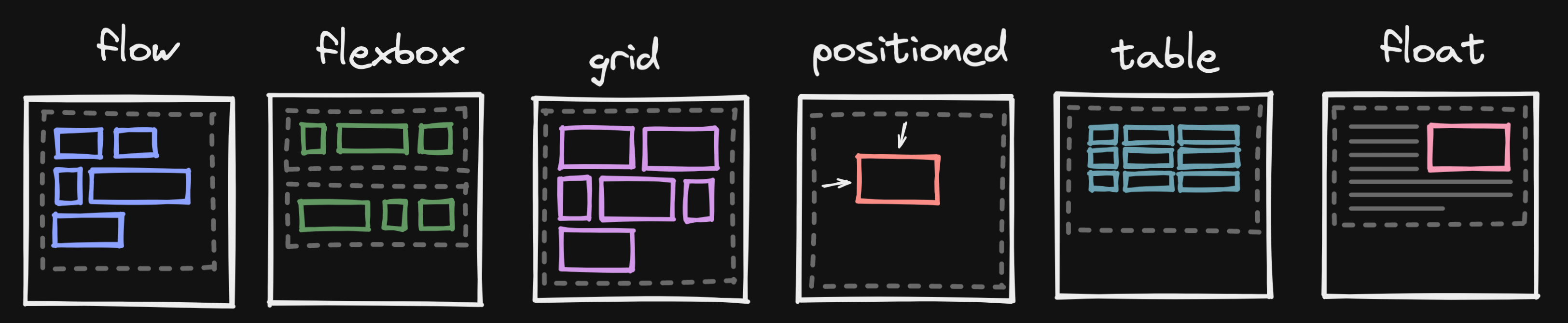
Introducing the float
The float CSS property shifts an element to the left or right side of its container until its edge touches the containing block edge or edge of another float. The following text and inline elements wraps around the floating elements. The floating element is removed from the normal flow of the page, though still remaining a part of the flow.
If there is not enough horizontal room for the float, it is shifted downward until either it fits or there are no more floats present. You can utilize the CSS clear property to position content bellow the floating elements on the left, right or both.
See the links for good examples!
Exercise: Grid System with Flex
You can use flex layout to position elements in one dimension. You can change the dimension and position in a row or column. Flex is very versatile and can be used for centring, local layouts, all the way to full page layouts.
There is great article CSS Flexbox Layout Guide by CSS-Tricks.
Grid system
This exercise is motivated by Bootstrap's grid system. Any element can be marked as a row using CSS class, a row s split to 12 virtual columns. Each element, columns, in a row specifies how many columns it occupies on which device size using a CSS class.
      <div class="container">
        <!-- Equal width -->
        <div class="row">
          <div class="col"></div>
          <div class="col"></div>
        </div>
        <!-- One column layout on a small screen. -->
        <!-- For lg screens use 6/12, 3/12, and 3/12 of the screen for each div respectively. -->
        <div class="row">
          <div class="col-12 col-lg-6"></div>
          <div class="col-12 col-lg-3"></div>
          <div class="col-12 col-lg-3"></div>
        </div>
      </div>
To support responsive design multiple breakpoints are defined for selected screen sizes, e.g. xs (< 576px), sm (≥ 576px), md (≥ 768px), ... To deal with the in-between the container center content and add space around.
Flex layout
Download this HTML document and fix TODOs in the source code. The results should look like this on screen:


Continue to the next slide once you are done.
Task Complete
Congratulations, if you have followed the instructions, you have just reached the end of this exercise.
Debriefing
- Any issues?
Exercise: Grid
Grid was introduce after the flex to provide more powerful layout options. Grid position items in a 2 dimensional grid. Same as flex it can be used locally all the way to the full page layouts.
There is great article CSS Grid Layout Guide by CSS-Tricks.
Exercise: Basic grid layout
Download this HTML document and fix TODOs in the source code. In order to test try resizing the window. The results should look like this on screen:


Continue to the next slide once you are done.
Task Complete
Congratulations, if you have followed the instructions, you have just reached the end of this exercise.
Debriefing
- Any issues?
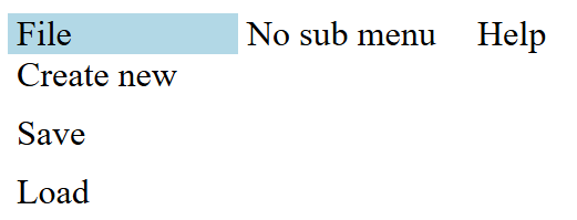
Exercise: Menu
Responsive design is not only about layout. We may need to change the look and structure of selected components.
Exercise: Responsive menu
Download this HTML document and add CSS styles to match the following images. You do not need JavaScript!


From 767 close
Continue to the next slide once you are done.
Task Complete
Congratulations, if you have followed the instructions, you have just reached the end of this exercise.
Debriefing
- Any issues?
Exercise: Cat page
The idea is simple text and images.
Cat page
Download the HTML file and familiarize yourself with it. Follow the steps on the following slides. The results should look something like this.


Continue to the next slide once you are done.
Articles
- Add 2 em padding left and right to all articles.
- Make the image in the second article float right but do not break the third article.
- Make the images in the first article 30% of the article width. Space the images evenly on the horizontal axis.
Continue to the next slide once you are done.
Header and Footer
- Make the top header bar not scroll with the rest of the page.
- Make the logo and the title in the header aligned in a row, vertically centered, with text in the center.
- Position the text content in the footer at the opposite end of a single line.
Continue to the next slide once you are done.
Layout
Use grid or flex to layout the articles. If the size is smaller then 768px use one column layout, else use two column layout. Update images so they fit the column width.
Continue to the next slide once you are done.
Menu
Use classes from the Exercise: Menu for the menu.
Continue to the next slide once you are done.
Dark mode
Check out prefers-color-scheme. Combine media query and variables to implement dark mode.
      :root {
        --text-color: black;
      }

      @media (prefers-color-scheme: dark) {

      }

      body {
        color: var(--text-color);
      }
Continue to the next slide once you are done.
Upload to webik
Upload the file to your public_html directory on webik page as cats.html.
Continue to the next slide once you are done.